
Now more than ever, donors are focused on outcomes. They want to know how their dollars are making an impact and how your organization is moving the needle. What methods can you use to communicate your results clearly and effectively?
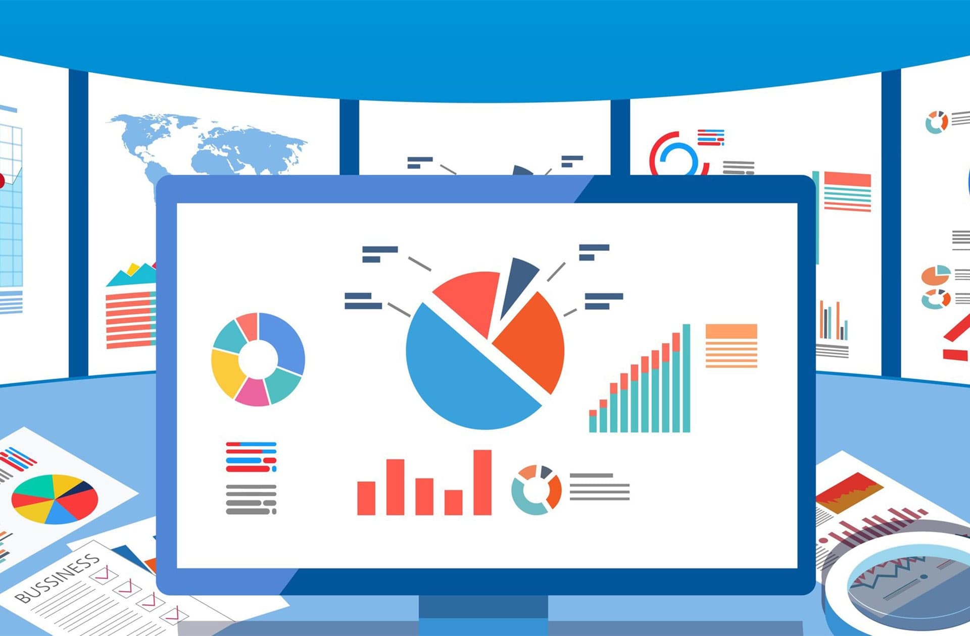
Enter data visualization. By placing the metrics you track in a visual context, you can help stakeholders understand their significance. Drawing on our presenters’ backgrounds in analytics and marketing, this webinar will share data visualization best practices and explain how you can use them to tell your story. We’ll run through a series of examples and everyday situations where a chart, dashboard, graph, or other visualization can help you connect with your supporters.

We’re ready to invest in your success. Are you?